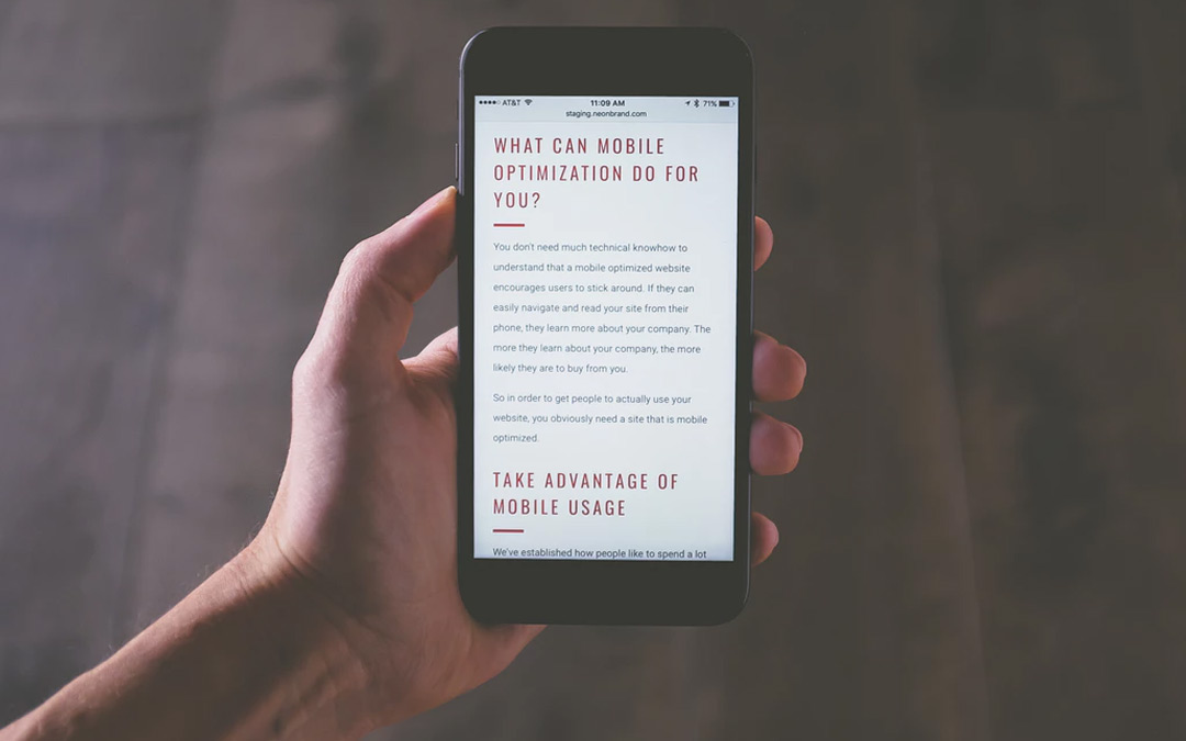
This blog article, 3 tips for creating an effective mobile website was written by Brian Casel, a professional web designer and founder of Restaurant Engine, a website design solution built for restaurants. In addition to consulting with restaurants on their website design, he also writes for several industry publications about web design strategy and web marketing for small businesses. This article provides some very important tips and advice that can help ensure that your site displays well on multiple devices.
3 tips for creating an effective mobile website
By Brian Casel
Mobile. Smartphones. Tablets. E-Readers. Everywhere you go, you hear experts say: “Your restaurant needs to be tapped into the mobile web.”
But what exactly does that mean? Here are few key strategies we use in mobile web design to attract more customers to restaurants, our primary customer base.
1. Your website and mobile website should be one and the same.
What is the best way to optimize your website for mobile, and make it easy to view on iPhones, iPads and other mobile devices?
The industry standard when it comes to mobile optimization is a technique known to web designers as Responsive Web Design. That means the website is designed to scale and adapt itself to fit any screen size and any device. In other words, your website and your mobile website are one and the same.
The benefits of having a responsive, mobile-optimized website are simple:
- You can manage and make updates to your website all in one place;
- Your website seamlessly scales down (or up) to fit any mobile device, even new ones that haven’t come out yet;
- Most mportantly — your customers who find you using their mobile web browser will see the same website they normally would, complete with your branding, colors and style, except it is conveniently re-shaped for the viewing in the palm of their hand.
So in a nutshell:
DO: Go for a responsive, mobile-optimized approach when having your website designed.
DON’T: Rely on third party apps that claim to convert your existing site to mobile. These only complicate the experience both for you and your customers.
2. Lose the Flash, music and other website roadblocks.
Many of us know that having any kind of Flash on your website has become a big “No No” in recent years. Why? Because Flash isn’t supported by many devices, including iPhones and iPads.
But it’s not just Flash you should stay away from. You should also lose that background music playing on your website. Not only is this a big turnoff to your visitors (no matter how soothing the song may be), but it adds bloat to your site, making it slower to load on mobile devices — particularly when the visitor is on a slower data connection.
All web users are in a rush to find what they need and move on. But mobile web users need answers NOW. So it’s more important than ever that your website doesn’t create roadblocks in their path.
For example, if your website has an introduction page that the visitor must sit through before accessing your website, you’re probably losing many potential customers. Rather than waiting or clicking “enter,” most users will just hit the back button and move on with their search for another restaurant.
DO: Make your website easy-to-access and include fast-loading content such as a few photos, your logo and some short text that is easy to read.
DON’T: Rely on Flash, background music, or any other roadblocks that only frustrate visitors when trying to access your website on a mobile device.
3. Include your contact info near the top.
Finally, here’s a tip that many restaurants can implement on their website right now.
We know your mobile website visitors are in a rush. But we can make a few more educated assumptions about these visitors. They’re probably looking for two key pieces of information:
- Where is your restaurant located? and
- How can they contact you to make a reservation/order?
Make it easy for them and ensure that the answer is right at the top of your website. As soon as they land on your website, the answers they’re looking for are in front of them. Right there, you’ve captured a larger chunk of your visitors and converted them into potential customers.
Be sure that your address and phone number are in plain text, not part of an image (and of course not part of a Flash piece). Why? Because many devices, like the iPhone and iPad will automatically convert phone numbers and street addresses into links. Clicking the phone number prompt them to call you right then and there. Clicking the street address will open up the Maps app and give them quick directions to your door.
DO: Include your address and phone number near the top of your website, in plain text.
DON’T: Hide your contact info at the very bottom of your website, or show it as part of an image.

