Wondering why your website looks as flat as a pancake? Want your website to stand out amongst your competitors? Our design team at Emmatt have some quick tips to help:
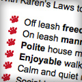
 1. Create unique list icons
Do you have pages on your site that are bland and lack the unique branding of your company? Try creating some custom list icons.
What is a list icon? A list icon is the bullet on a bulleted list, and just like in any word processing program, they can be replaced with a unique icon. Creating your own list icon can give a plain page more personality and creativity.
Looking for a subtle change that still gives your website a complete makeover? Check out this example: http://www.ontariodogtrainer.com/.
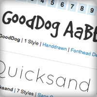
2. Use custom, server-based fonts
Typically websites use standard, web-safe browser fonts that both Windows and Mac can display well on all computers, which can also make websites look boring. However, many custom, open-source web fonts have become available over the years, and many websites incorporate these into their design.
With sites like Google Web Fonts and Font Squirrel providing server-based fonts that are free for commercial use, it’s no wonder it’s so popular. Just changing the font on your website can completely alter the feel and look of the site!
3. Use understated patterns and gradients
A lot of people avoid patterns and gradients on the web. If not made correctly, they can look extremely fake or even obnoxious. But a subtle pattern or gradient can really help to add depth and creativity to a website.
Here are two examples that work well:
http://tccss.org/ and http://greywoodhomes.com/.
Would you like some help to improve your website? Contact us today to discuss your website makeover!


